
Eat Up Meal Planning Tool
September 2022
Everyone needs to eat.
Cooking food at home saves money.
But it’s not easy.
I’m not the most experienced cook, I’m not a foodie, and deciding what to eat often feels like a chore. I felt like my family and I had been eating the same things without much variety, so I wanted to mix it up. One week I planned and scheduled every meal, snack, and I also scheduled the prep work. That’s what got me thinking about meal planning as a problem. My first thought was maybe this scheduling prep work was the key. If it worked for me, maybe it would for everyone else?
Growing up, my mom had something like this. A recipe box with cards, occasionally pulling something from a cookbook. A tested recipe shared by a friend or a relative got added to this box. You’d pull out a card, check the recipe, and check the ingredients. Next came writing down a shopping list and adding whatever else you needed.

Life is different now.
Everyone seems to be busier.
It’s easier to buy stuff, but we have less time.
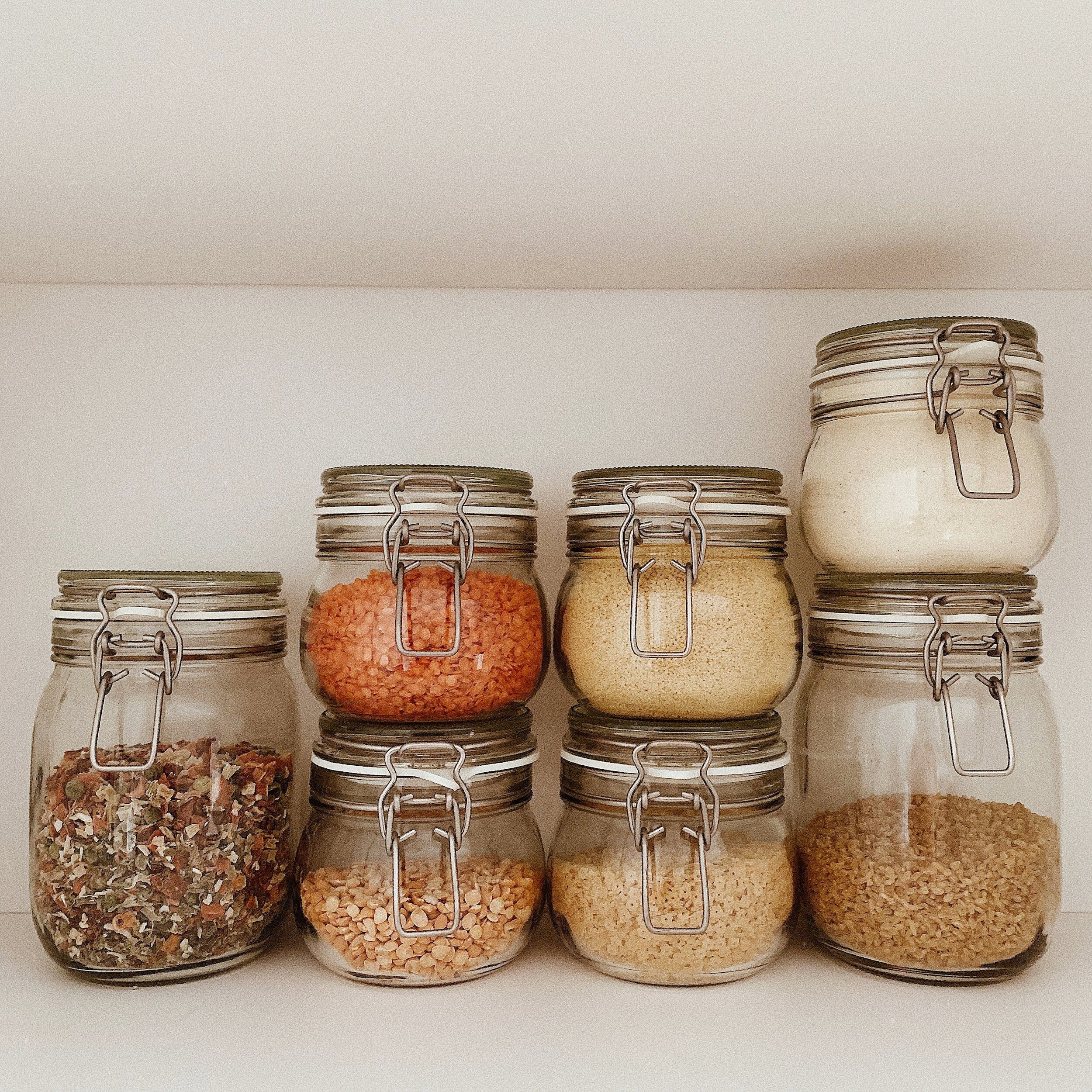
If we were living our best lives, our cupboards and fridges might look something like this…
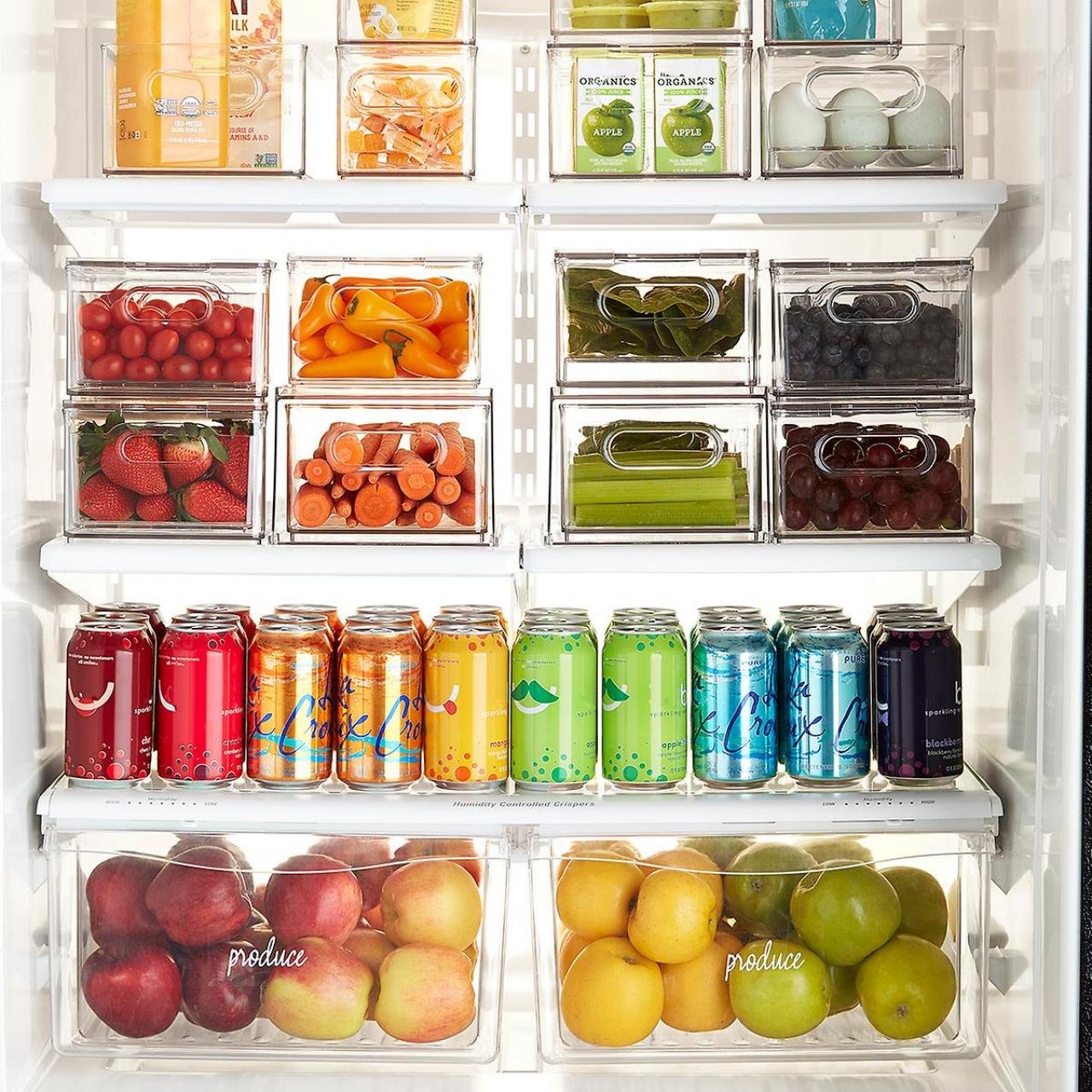

But in reality, it’s a little more like this.

User Interviews
As the first step in trying to figure out how I could design a solution to help solve this problem, I talked to a few people to find out about how they plan meals, and to figure out if the scheduling of prep work was key for them too.

I came into it thinking everyone else would have the exact same problem as me.
Turns out, everyone seemed completely different. One person cooks a couple meals in one big go on Sunday and eats the same food throughout the week. One person would only cook everything fresh, every other day and have leftovers the next day.
Two of them were experienced, skilled cooks. One absolutely would not eat the same leftovers multiple days in a row, and had a tendency to rotate meals and re-purpose leftovers into new meals. Another interviewee felt less organized and more spontaneous, but would always have something prepped in the freezer.
Competitive Research
I looked at other mobile apps used for meal planning, with two competitors standing out:
Mealime was nice and clean looking, but too restrictive - it provided set recipes and didn’t let you add or import your own recipes
Paprika is a tool that has been around longer and has a lot of useful features. However, it requires you to put in a lot of effort to get the kind of payoff I was looking for - I wanted this tool to be useful even with minimal effort on the part of the user.

Understanding the User
I took what I learned from the user interviews and made an affinity map, grouping thematically common points to help find what they did have in common. I then used that to make a persona as an exercise to think more deeply about who would be using this tool and why.
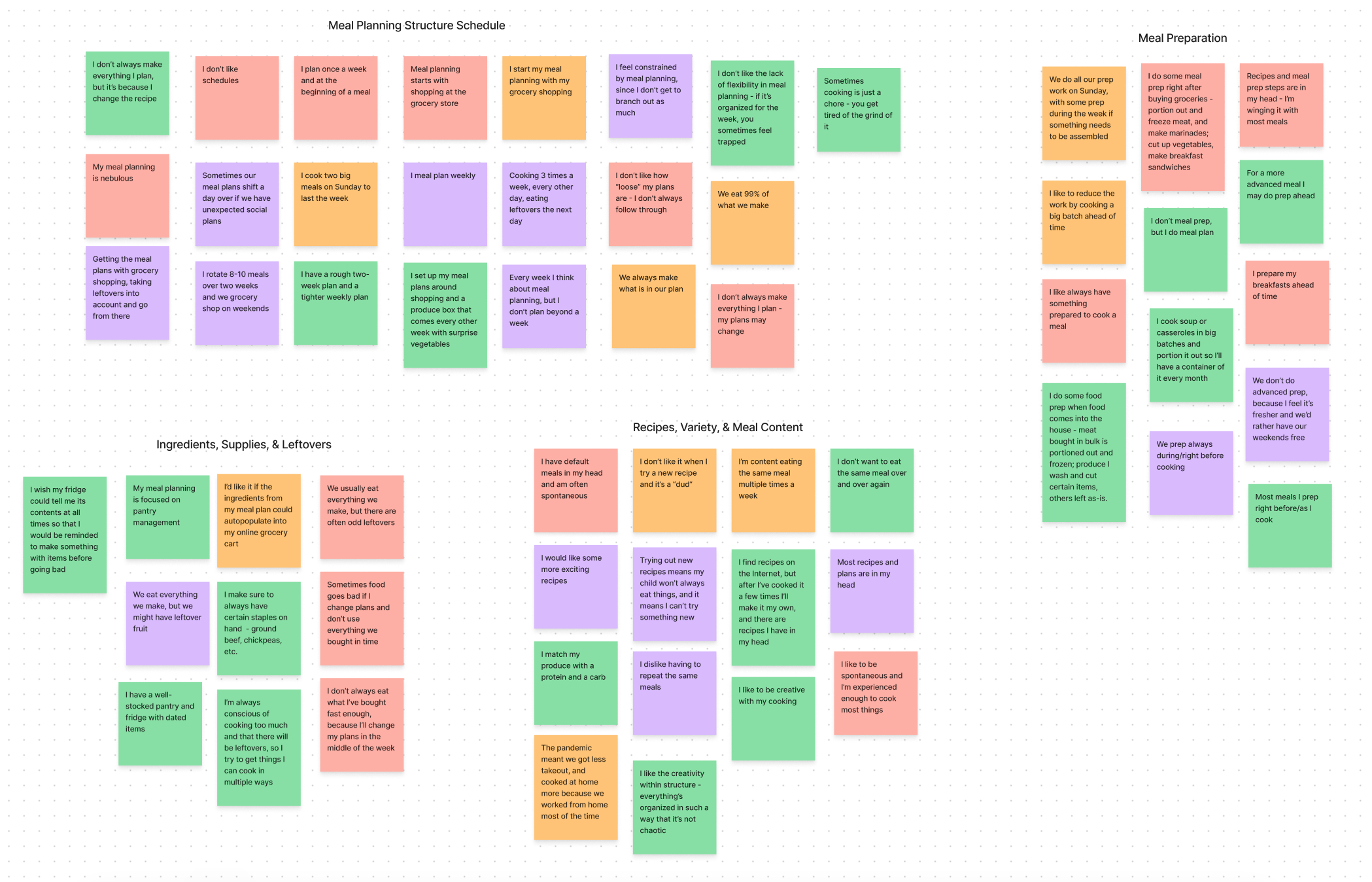
Affinity Map
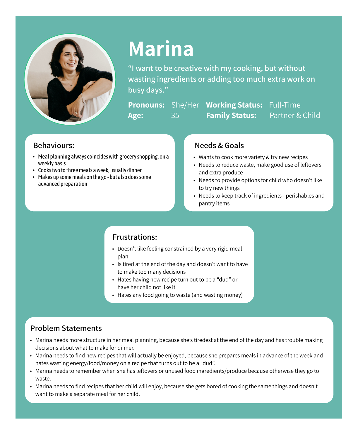
Persona
Commonalities & Key Takeaways
Everyone hates wasting food
Everyone wants variety
Grocery shopping is strongly tied to meal planning

Planning
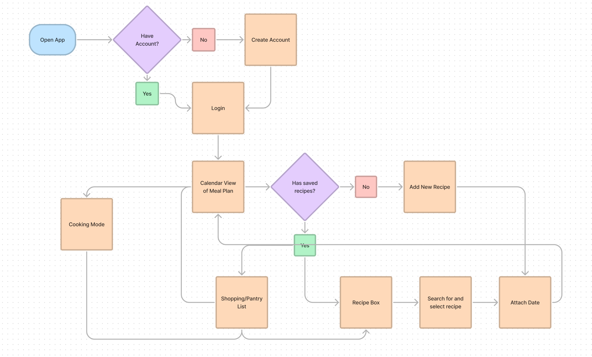
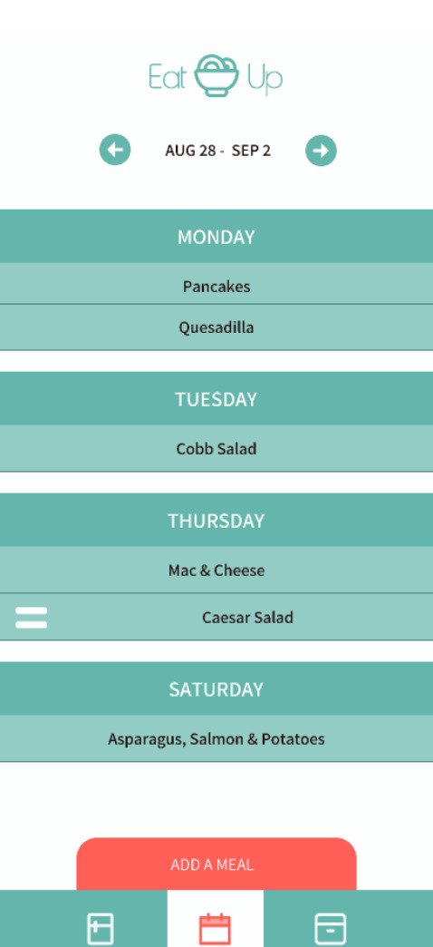
I started listing out what our goals would be for each user, and what features would be needed to achieve them. After going through a few exercises to flesh out my ideas for features and functionality, I started sketching rough wireframes and creating a basic user flow.


User Testing, Updated Prototype & Style Guide
I conducted a moderated user test, asking participants to open the prototype and try to walk through basic functions. Through this observation, I was able to identify a number of elements that needed to have their intended functionality made more obvious and visible.
From there, I created a higher-fidelity prototype, including an onboarding flow for new users, and style guide with reusable components.


During my process of creating a colour palette, it seemed as though the bright and vibrant colours of fruits and vegetables, like bright reds and deep greens, were the most commonly associated with food. However, this app is not intended to get you to eat food right now, but instead to calmly consider and plan food for the coming week(s). As such, I settled on more muted versions of those colours - a teal and a dark coral pink.
Unmoderated User Testing
Using the testing tool Maze, I conducted an unmoderated user test on my higher fidelity prototype. Through this process, I learned that some of my UI choices (such as swiping left or right to move/delete menu options) were not readily apparent to testers, while others worked as expected.

Yes
No
Next Steps
I then created a supplemental prototype with updated UI and features to reflect the results from my user testing.
My next steps are to polish up the design, revisit my original list of features, add additional ones that have come up in this process, prioritize them, and start prototyping them. Following that, probably more testing and iterating until I have something that could maybe work in the real world.


